
[ad_1]
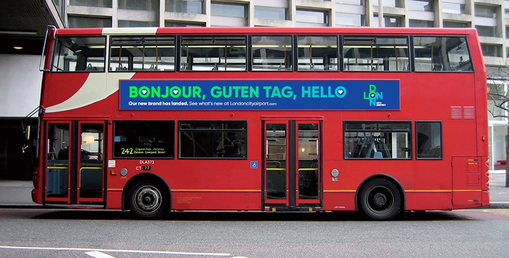
London City Airport has revealed a new brand identity, reflecting a more vibrant and contemporary look, synonymous with modern London.
The transformed design, which utilises vivid colours and a heart motif, reinforces London City’s role as London’s most central airport. The logo employs modern typography, created by The Allotment, complimenting the Gilroy font for wider uses.
The step-change comes as the airport continues to grow aiming to appeal to a changing mix of passengers, particularly leisure travellers and East Londoners, joining the established business traveller base. Between June and September 2018, the proportion of leisure travellers exceeded business travellers (52% versus 48%) and a record 4.8 million total passengers used the airport last year.
Robert Sinclair, CEO of London City Airport, said: “With our development programme now underway, we have an amazing opportunity to develop an airport experience that truly reflects modern London.
“Everything that is great about London”
“Along with the design of our new airport, this new brand identity will help us reflect everything that is great about London, celebrate its preeminent position as a truly international city, broaden our appeal to different types of passengers and make the experience of London even better for those visiting the capital, for business or leisure.”
The vivid blue colour used in the logo represents the location of London City Airport, in London’s historic Royal Docks in Newham, close to the River Thames, the iconic waterway that has served London for thousands of years. Use of vivid green represents the many parks and green spaces in London and confirms a departure from the conservative grey and blue combination.
The new identity comes during a GBP 500 million four-year development programme, which will transform the airport and make the experience of travelling to and from London even better.
“A huge creative potential for interaction”
Neil Dillon, marketing director at London City Airport, said: “The new design is much more fitting for our 21st-century airport in the world’s greatest city and this sentiment has resonated in our research with existing and new customers. From a design perspective, the new branding is agile and has a huge creative potential for interaction with different mediums and spaces, both now and in our future terminal building.”
The new corporate identity has been rolled out across all digital platforms, with the airport’s assets switching over to the new look over the coming months.
[ad_2]
Source link